hARTlabMagic:RelaisBoréaleHasaLanguageofItsOwn
In November 2022 at a trade show in Quebec City, Boréale’s Gabriel Dulong approached Hart Print with a challenge. As the Master Brewer of Relais Boréale, a brew pub in Montreal and offshoot of the commercial brewery, Gabriel was looking for a clean, fresh and versatile can design to help get his experimental beers rapidly onto consumer shelves to satisfy the take-home market. He also wanted to maintain a level of sophistication with the packaging by avoiding quick-fix stickers.
Hart Print’s hARTlab design service was on the case. Equipped with a preliminary concept from the folks at LG2, Design Lead Etienne Bonneville set out to generate a utilitarian formula that would allow the customer to mix and match simple patterns with bold and fun colors. What Etienne developed was essentially a packaging language exclusive to Relais Boréale.
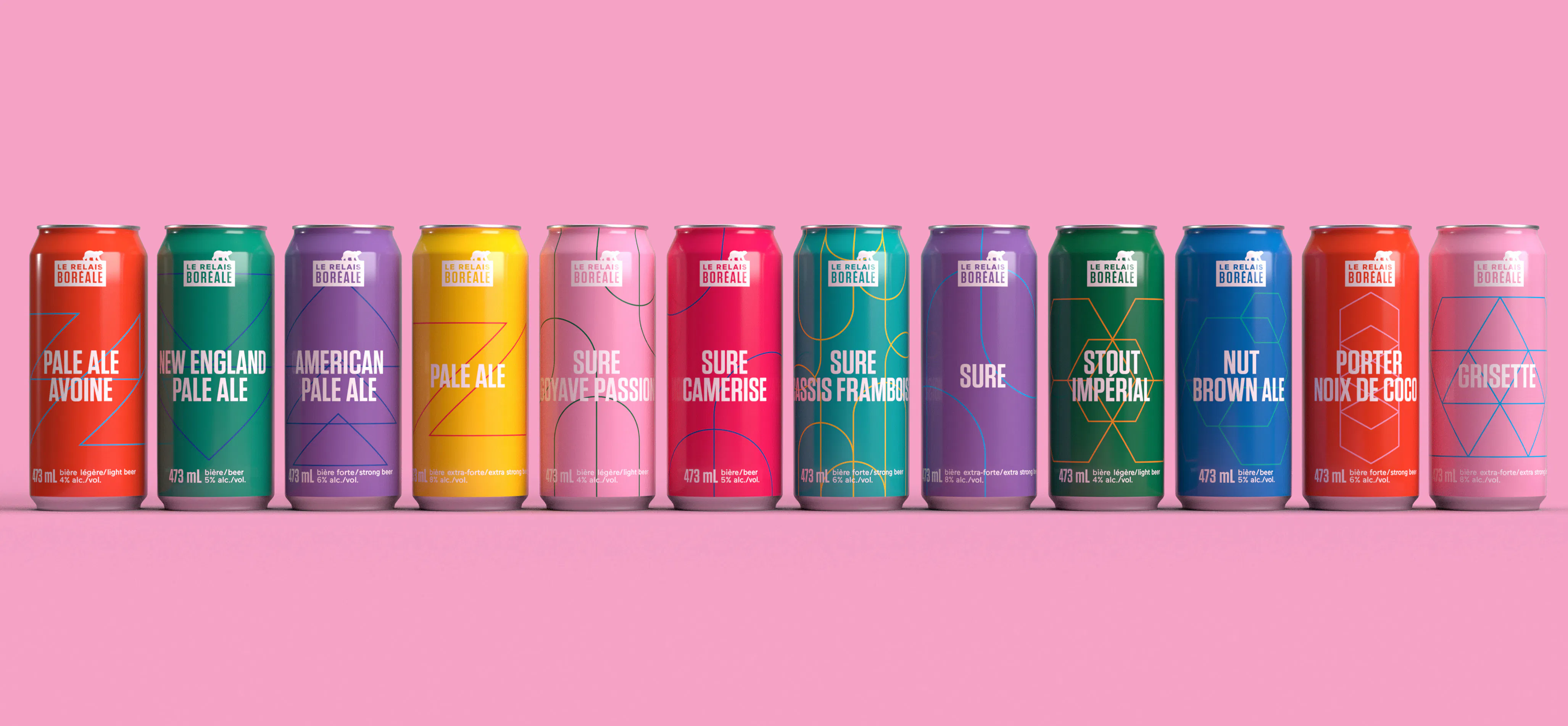
“Each of the 24 patterns is inspired by the brewing equipment and decor on site,” Etienne indicates. Grids, circles and triangles are often repeated in the uncomplicated lines. “The customer insisted that the beer style be featured front and center on the can, so there are no fancy illustrations to compete with it.
“The customer also wanted a very colorful beer fridge at the brew pub,” Etienne continues. “With the customer, we settled on 17 potential can colors that are guaranteed to catch a consumer’s eye.”
As Relais Boréale cans an average of 5 to 10 different experimental brews each month, Gabriel and his team require a quick and cohesive packaging design to accommodate their needs.
“Gabriel touches base with us, tells us which combination to use and we get a file to him for approval within 24 hours,” says Etienne.
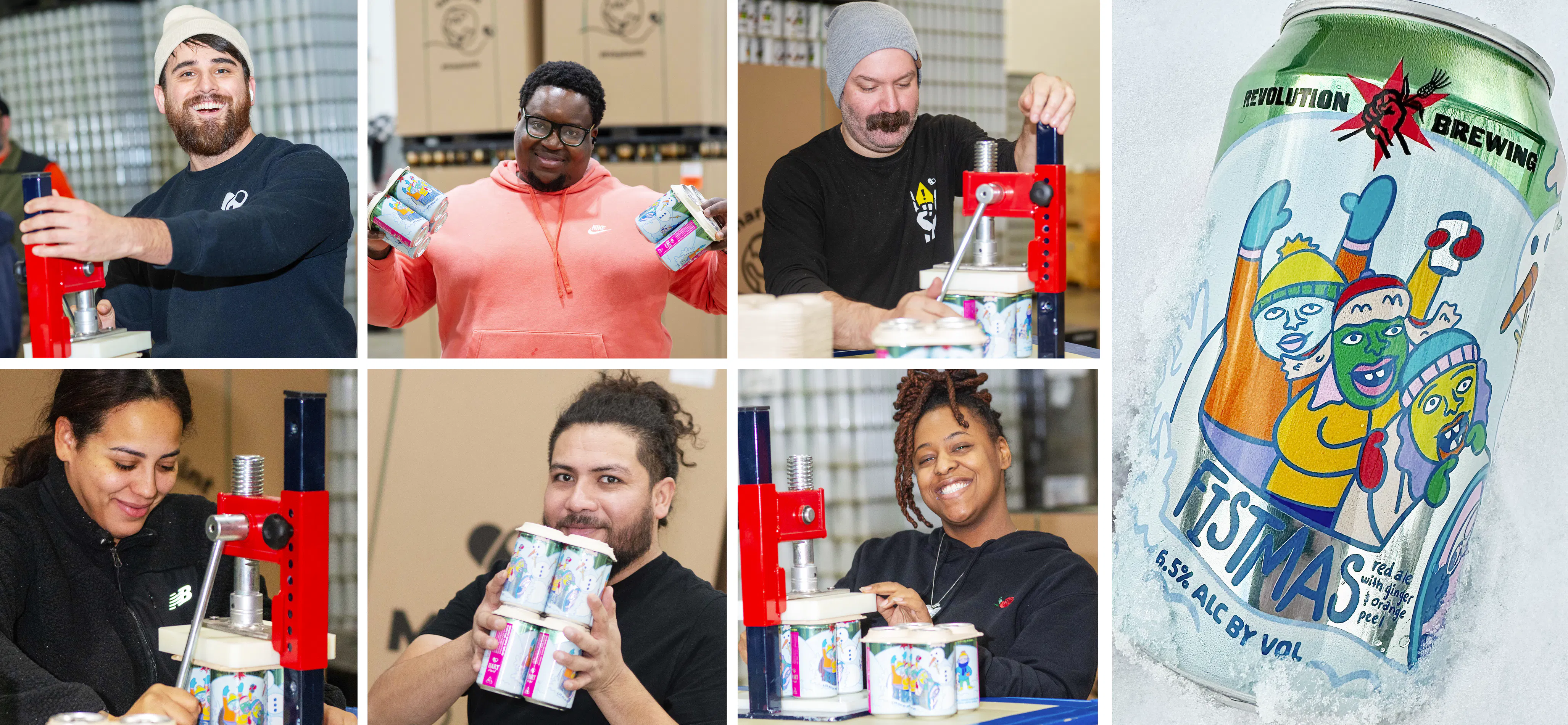
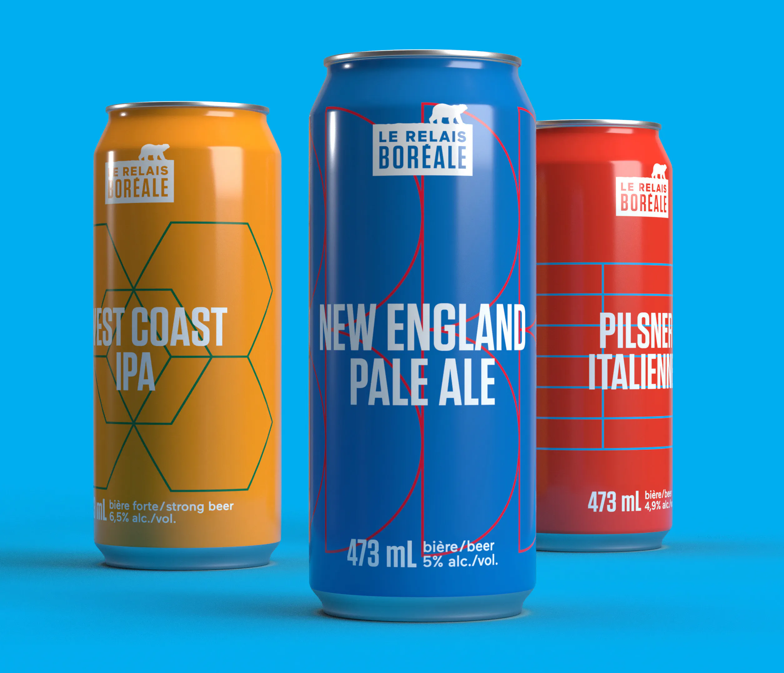
Less than five months after that initial conversation with Boréale, Hart Print began printing cans for Relais Boréale. More than 40 different can designs have been created using hARTLAB’s pattern + color formula, giving each Boréale brew a sense of individuality and cohesion. In fact, earlier this year, Boréale hand-picked the three most popular beers from the Montreal brewpub to make available to the general public all across the province with its collection La Série Relais. And while the can quantities have changed to accommodate the larger clientele, the can design remains the same.
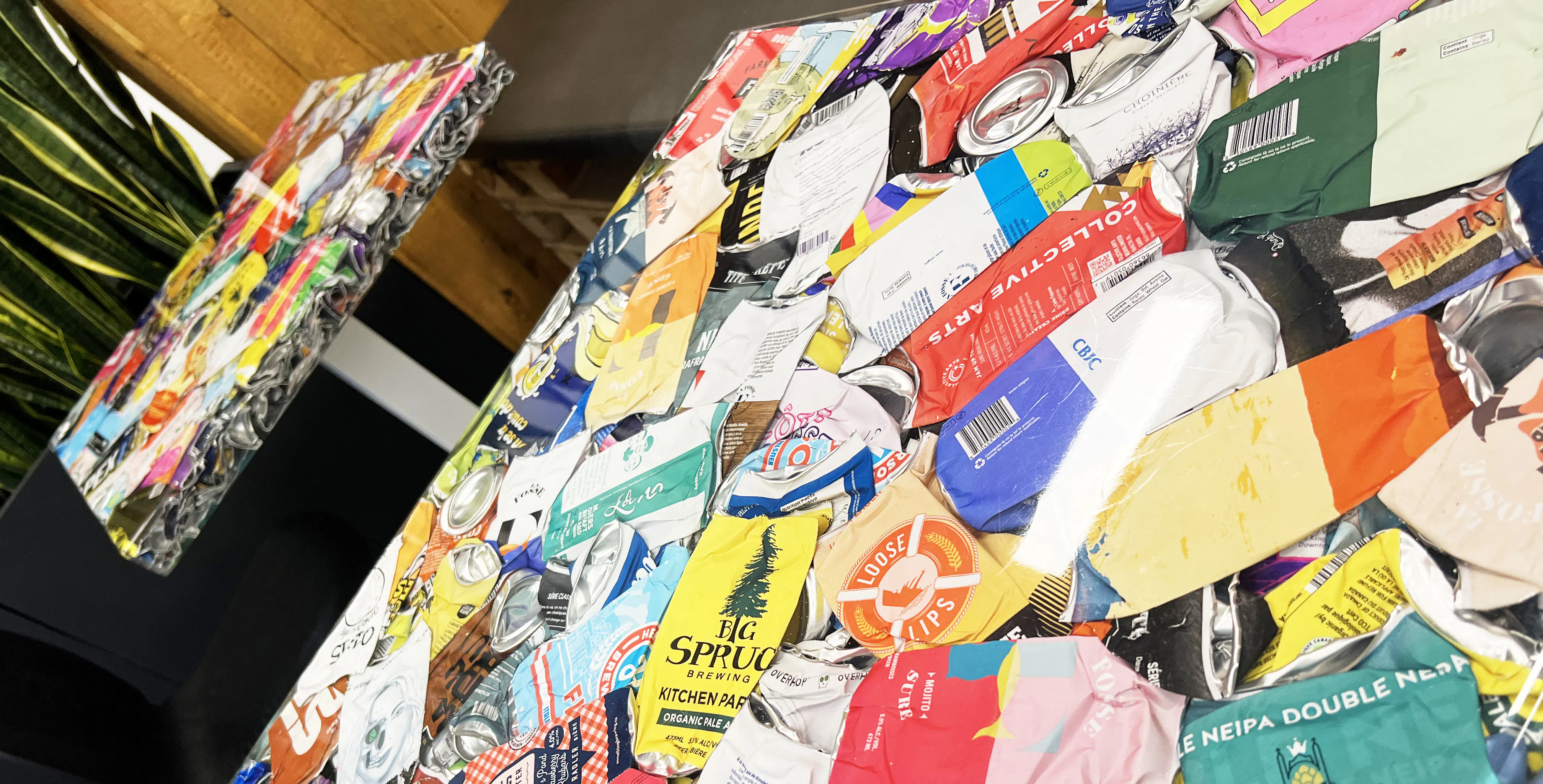
What helps make this experimental solution possible is Hart Print’s digital printing versatility. We work hard to keep our turnaround times nice and low, and customers can order as little as one pallet layer at a time. Thanks to Hart Print’s aluminum can printing innovation and hARTLAB design services, the quality of the packaging on the outside reflects the quality and care of the product on the inside.
“What I like about this concept is its scalability,” says Etienne. “If the customer runs out of combinations, we can add to it quickly and easily without removing the essence of the brand. As long as they keep making new beer styles, we'll keep making new can styles.”
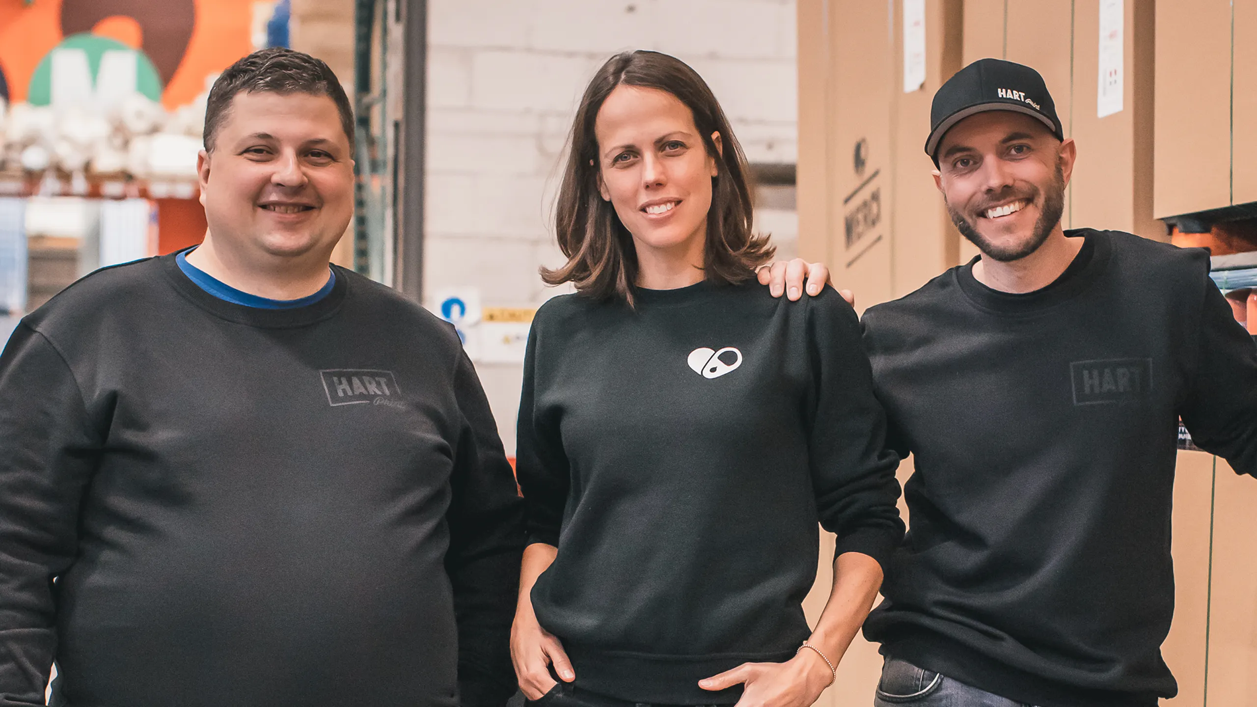
Hey! Want to work in an inclusive environment where we embrace each other’s talents while elevating our differences? Check out our Careers section for opportunities at Hart Print, and let’s create some cool sh!t together!

StoriesatHart